I loved the colour combination in
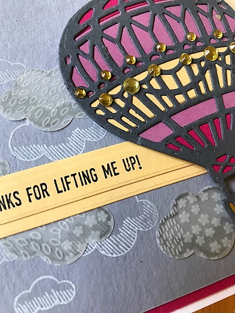
Colour Throwdown;s #457 and had intended to make a very subtly coloured card, full of delicate detail. So much for that idea - the colours got stronger the more I played around. I did, however, work hard to keep the clouds light, in keeping with
As you See It's sketch #157 - I liked the idea of them gently supporting the rest of the image, rather than being an overwhelming part of it. To that end, I used vellum and the outline stamp in Whisper White, rather than a bolder die cut white.
Here's the card:
Made using: Stampin' Up paper (Daffodil Delight, Sweet Sugarplum, Melon Mambo, Smoky Slate, Basic Grey), ink (Basic Black, Whisper White, Smoky Slate), vellum (Botanical Gardens), Stamp sets (Lift Me Up), dies (Up and Away).
Other Products: francheville rhinestones, My Favourite Things Dies (a freebie) for the sentiment